Dear Reader,
We’re experimenting with a new format: the visual essay. It’s more staccato and a bit messier than our usual posts, as I believe that voids create space for thought. You can find the first edition in the series on politics and design here. The second edition will explore (design) manifestos, a topic I taught in a course at the University of Art and Design in Offenbach, Germany, about a year ago—and that still crosses my mind a lot.
xoxo,
Nina
~ RECENTLY ON OUR CHANNELS ~
Where Is The Latest Sh*t? – Visiting creative director Mike Meiré in Cologne
Job alert! Are Designers The New Undertakers? – On death & design
The Private Braun Collection – Visiting the Ettel Collection in Berlin
Studio Visit: Hannah Kuhlmann – Visiting the collectible designer in Cologne
Book Rec: Who Can Afford to Be Critical? – A must-read after visiting Dutch Design Week

The OG Manifesto: The Manifesto of the Communist Party, written by Karl Marx and Friedrich Engels in 1848. Ending with the call to action “Workingmen of all countries, unite!”, it is often regarded as one of the most influential political texts of all time, being the first attempt to explain their idea of historical materialism to a wider audience, in which “the history of all hitherto existing society is the history of class struggles”. The word “manifesto” itself is derived from the Latin word manifestum, originally meaning “clear” or “obvious,” and later referring to a public declaration. However, since the 19th century, the term has been embraced by political opposition groups.
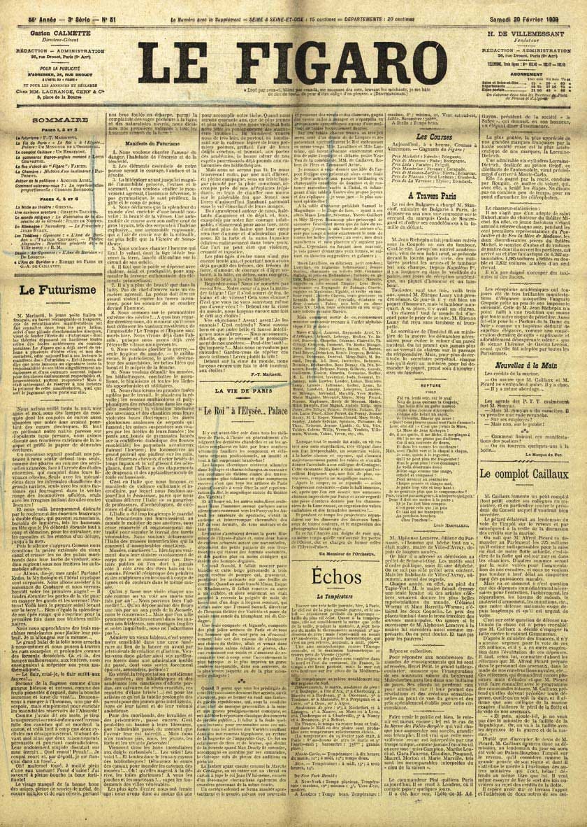
The political manifesto made its way into the “art world” (though the art of the avant-garde was a way of life, and therefore also positioned within the political sphere) with The Futurist Manifesto by Filippo Tommaso Marinetti, originally an Italian writer who later became an early supporter of Mussolini’s fascist movement. Reading The Futurist Manifesto today feels like a wild ride (literally): it’s intensely focused on war, fast cars, and airplanes, with war, fast cars, and airplanes, and is both misogynistic and vehemently anti-feminist, as well as critical of the cultural elite. If you choose to read it, be prepared, because it feels disturbingly relevant today, evoking comparisons of populist speeches and posts—a stark reminder that hate can be a powerful tool. What’s also interesting is the manifesto’s prominent publication: what today might be considered X was, back then, the front page (!) of a French newspaper. The Futurist Manifesto marks the birth of both the avant-garde and futurism.
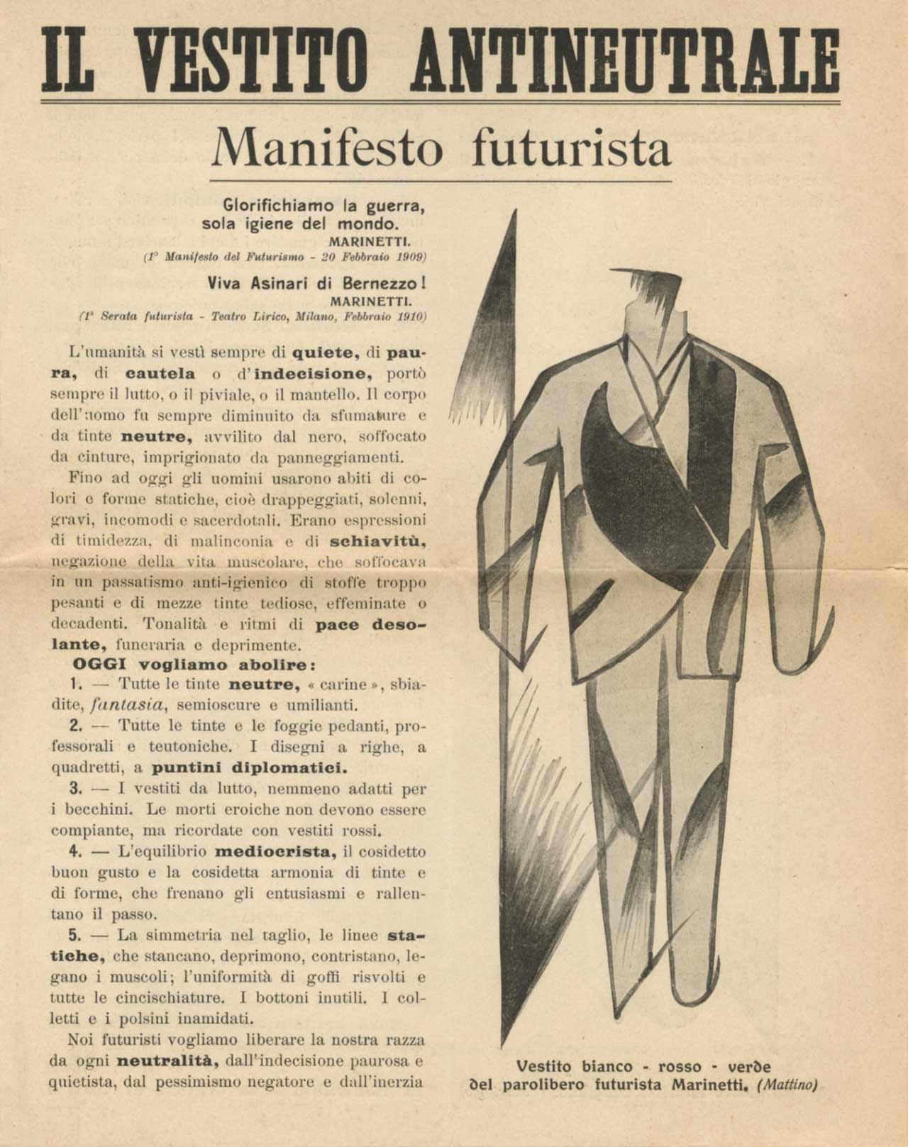
The Futurists absolutely loved manifestos, creating one for almost every aspect of life, often infusing them with Fascist ideology: Futurist cuisine, colors, cinema, art, and more. Giacomo Balla wrote the Futurist Manifesto of Men’s Clothing in French in February/March 1914. After the onset of WWI, it was heavily revised by Marinetti and rebranded as “The Antineutral Dress – Futurist Manifesto” in Italian, emphasizing the need for Italy to enter the war. This significantly altered the manifesto’s original intent. As Giovanni Lista notes in this essay, “In the original French version of the manifesto, he revived [the] idea of colourful clothing, which would animate the city by decorating its streets, as a festive and ephemeral artwork in continuous motion. Futurist dress was designed for an urban setting, not as a function of the individual but to define a social climate. Dress became a manifesto itself, a business card, an item of Futurist faith.”

The Dada movement, founded as an anti-art movement by exiled artists in Zurich during WWI, quickly spread to several cities like Berlin, Paris, and New York, quickly becoming a significant avant-garde movement. The movement had multiple manifestos—I counted three. This particular manifesto was written by Richard Huelsenbeck for a Berlin Dada-Soirée in April 1918. The Dadaists adored their soirées—lively evening events where they showcased chance poems, satirical speeches, and sound-imitative performances. Huelsenbeck’s manifesto is fast-paced, biting, and ironic, concluding with a quintessentially Dada contradiction: “To be against this manifesto is to be a Dadaist!”

One of the most famous architectural manifestos in Western design canon wasn’t even called a “manifesto” initially. Later known as the Bauhaus Manifesto, Walter Gropius’s text was originally titled “Programme of the Bauhaus” and published as a brochure to attract new students. Manifestos have always been marketing tools, after all. Art historian Magdalena Droste highlights the success of the Bauhaus’s media campaign: “That is why the Bauhaus manifesto was enclosed with many magazines or mailed out upon request. Today, we know that it really did attract many young people to the Bauhaus […] These included Josef Albers, for example, and also Gunta Stölzl.”
Let’s shift forward in time. Design, at least in the form and self-conception we recognize today, is a relatively new discipline. To find a “real” design manifesto within the Western canon, we need to look a bit further ahead. The First Things First manifesto was published in 1964 by British designer Ken Garland, along with about 20 designers, photographers, and students who were frustrated with marketing products like “cat food, stomach powders, detergent, hair restorer, striped toothpaste, aftershave lotion, beforeshave lotion, slimming diets, fattening diets, deodorants, fizzy water, cigarettes, roll-ons, pull-ons, and slip-ons.” In this witty and critical tone, they sharply criticized the consumerism-driven advertising industry of the time—remember, this was still the “Mad Men” era.
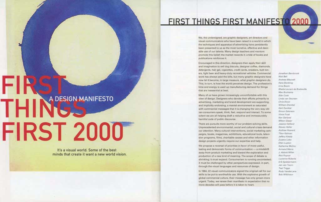
The manifesto was reissued by Adbusters magazine in 1999 as First Things First 2000, following what may have been the height of the advertising industry, and again in 2014 and 2020. First Things First has fascinated creatives over the years, but (unsurprisingly) couldn’t change the capitalist nature of the discipline.
Welcome to the age of the (self-promoting) manifesto! In August 2007, Icon magazine launched its “Manifesto Issue,” inviting 50 designers (and architects) to contribute manifestos, resulting in 18 pages filled with “rants, raves, musings, and drawings”. This issue is somewhat amusing, as it takes the manifesto as a self-promotion tool to its extreme, proving that “manifestos” sell well—especially at newsstands. The Bouroullec brothers only submitted a single drawing, while Stefan Sagmeister contributed a list of diary-like entries, which he had already previously published as 3D-illustrated typography.
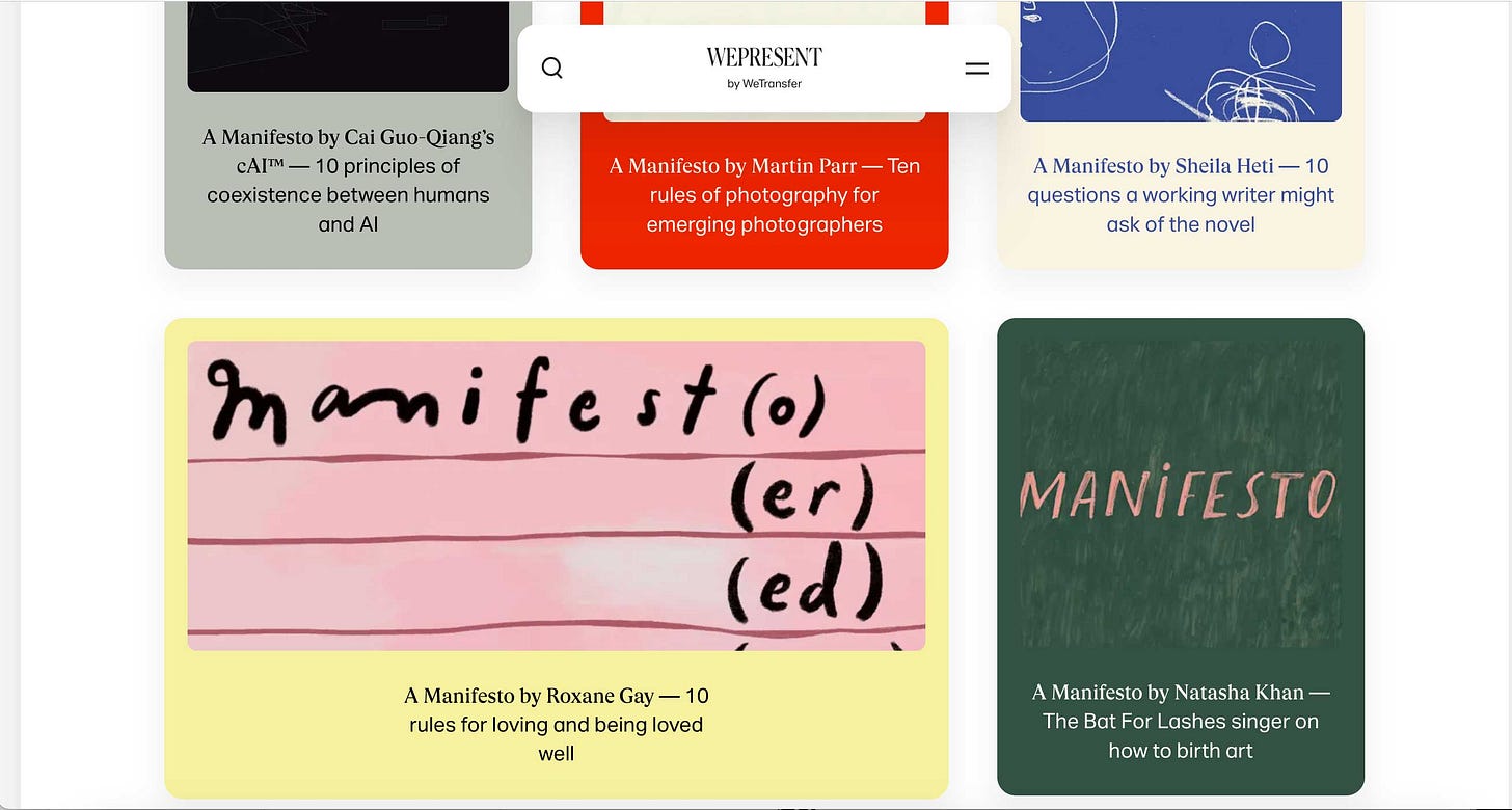
The logical continuation of Icon’s “Manifesto Issue” might be WePresent’s “A Manifesto By,” a series on the online magazine run by the online service WeTransfer, “which invites activists and creatives with something to say to write 10 rules to live by”. From an editorial standpoint, I can understand why this format works: Manifestos often take the form of bullet-point lists, making them clickbait-worthy and perfect for our short attention spans. Unfortunately, many of the “manifestos” published on WePresent have a diary-like quality, reflecting how washed out (and redundant) the term of the manifesto has become.
Honorable Mentions (aka: Manifestos That Really Had Something to Say)
Keep reading with a 7-day free trial
Subscribe to something is missing to keep reading this post and get 7 days of free access to the full post archives.



![The cover of Icon’s “Manifesto Issue”, featuring the text : “50th issue we asked […] fluential architects […] designers and thin […] they believe in. […] s is the Manifesto Issue.” The names of the "influential designers and architects" are scattered across the red background, including Zaha Hadid, Jasper Morrison, Bruce Mau, the Bouroullecs, and others. The cover of Icon’s “Manifesto Issue”, featuring the text : “50th issue we asked […] fluential architects […] designers and thin […] they believe in. […] s is the Manifesto Issue.” The names of the "influential designers and architects" are scattered across the red background, including Zaha Hadid, Jasper Morrison, Bruce Mau, the Bouroullecs, and others.](https://substackcdn.com/image/fetch/$s_!bImE!,w_1456,c_limit,f_auto,q_auto:good,fl_progressive:steep/https%3A%2F%2Fsubstack-post-media.s3.amazonaws.com%2Fpublic%2Fimages%2Fe410d706-d17d-4720-8c8d-fe22681032c9_1200x1600.jpeg)
